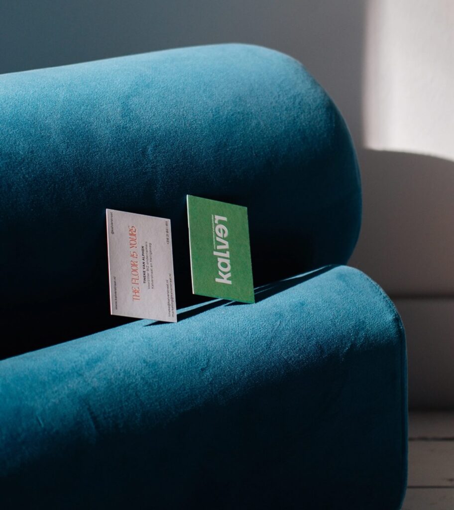
Kalverstraat
The street of childhood memories and nostalgia – timeless yet contemporary. The street of Ajax and Mondriaan. Calves and oxen. Stock traders. Fashion enthusiasts, writers, and poets.
Kalverstraat isn’t just one of the oldest but also the ‘youngest’ street in the Netherlands. Always in motion. Dynamic and diverse. In offerings and especially, in its public. With over 2 million visitors per month (2019), Kalverstraat is the most renowned shopping street in the Netherlands. This is no small task; it offers perspective.
Time for a new vision. The Time is Now.
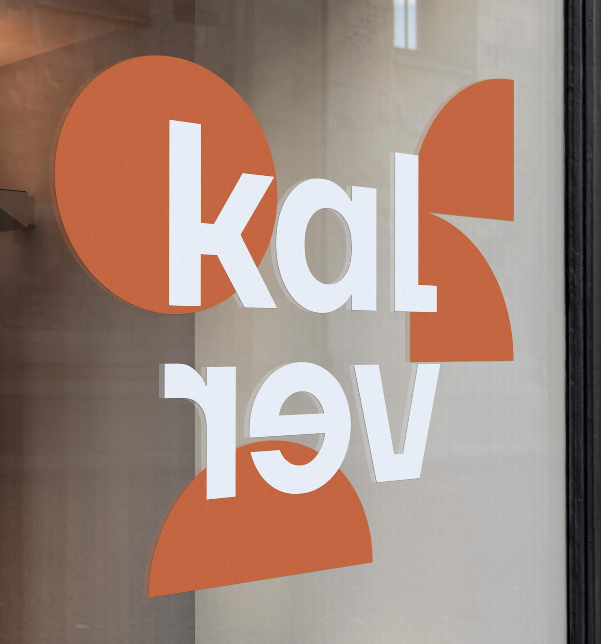
The identity is crafted from elements of the Modernist era (1914-1918) in a contemporary manner. Playful yet always conscious. With a nod to the past, we revive nostalgia.


Built from geometric forms - circle and square - together, these shapes symbolize unity and trust.


The Kalverstraat’s playful, solution-focused, and forward-thinking character, creates the perfect basis for transformation.
“We have a more qualitative and unique but still timeless look and feel. We’re a lot more consistent in text and image. This has an enthusing effect on visitors and stakeholders.”
The old branding of the Kalverstraat was outdated, not always clear and it wasn’t really stimulating. The new branding has done a lot for the uniformity of the Kalver area and the visual outings. We succeeded in implementing a creative form, that represents the area as not only a place for teenagers and fast fashion.
The collaboration with La Même is always very pleasant. They are quick, clear and bring quality.
Nico Mulder
Kalverstraat