Prodentfabriek
The industrial event space of Amersfoort, reimagined.
Strategy & Positioning
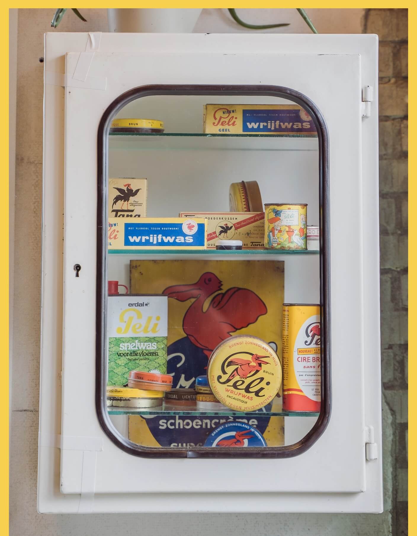
The Prodentfabriek is a place with a soul. In the past, it annually produced 100 million tubes of toothpaste.
With its new branding, the Prodentfabriek emphasizes its dual role as both a business and cultural meeting point. In addition to symbolizing ‘a place with a soul,’ the dot in the logo also signifies unity and connection — values that resonate with a cultural hub.
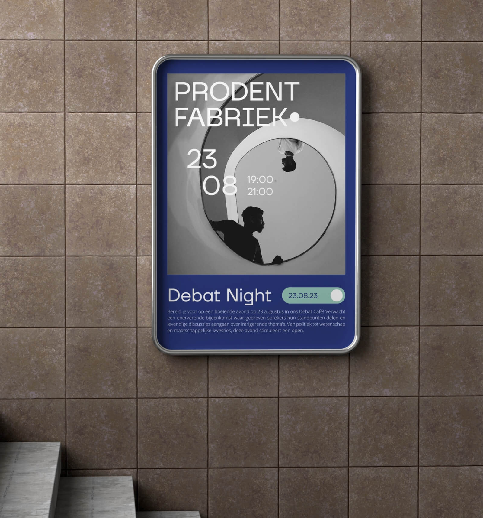
Visual identity
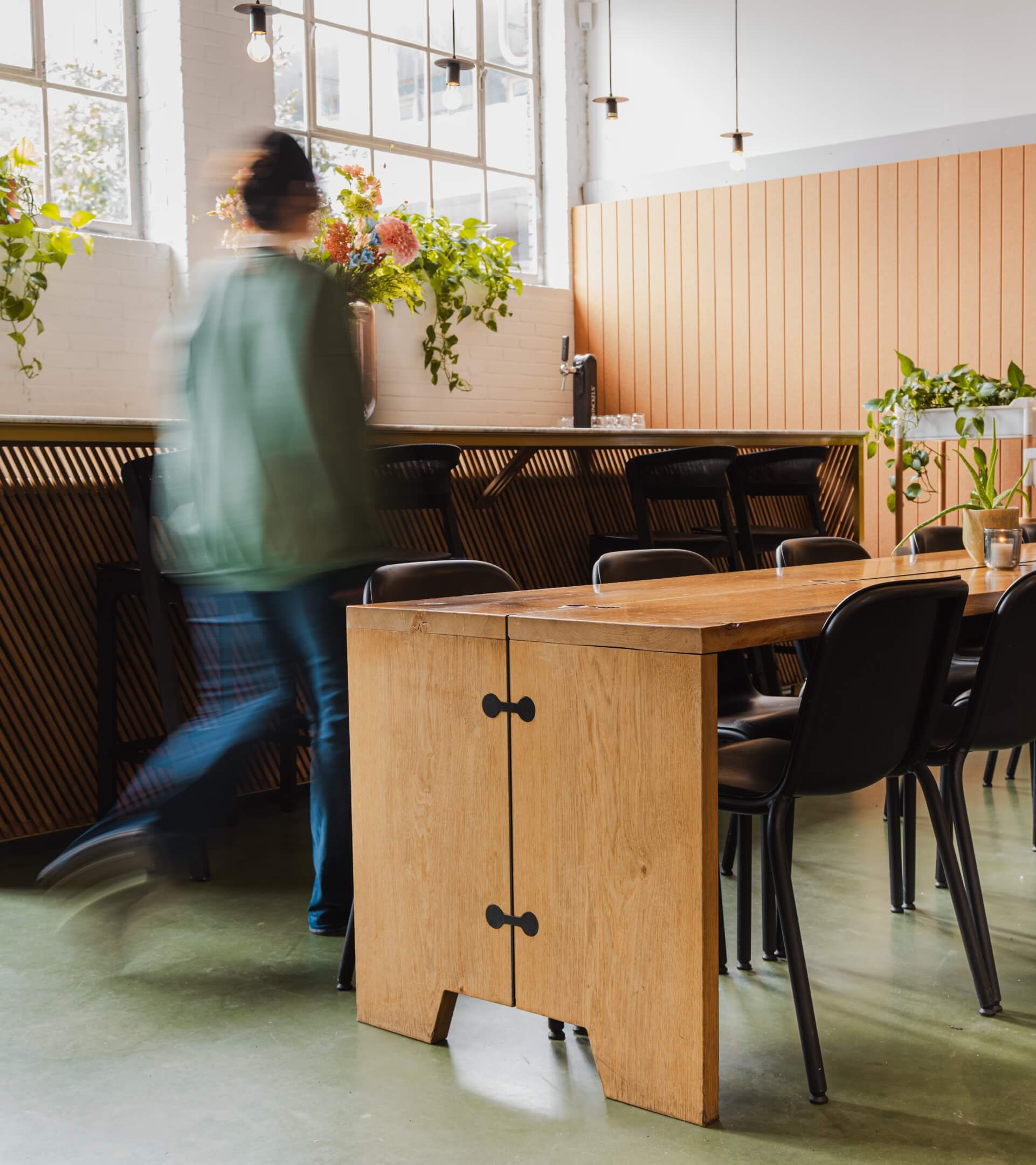
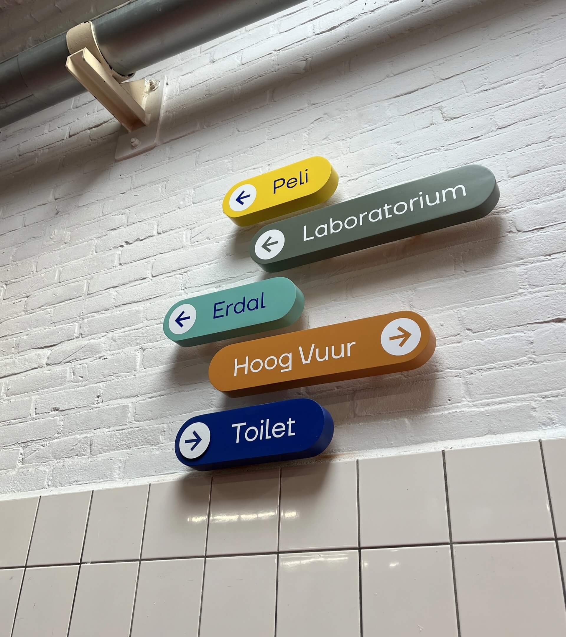
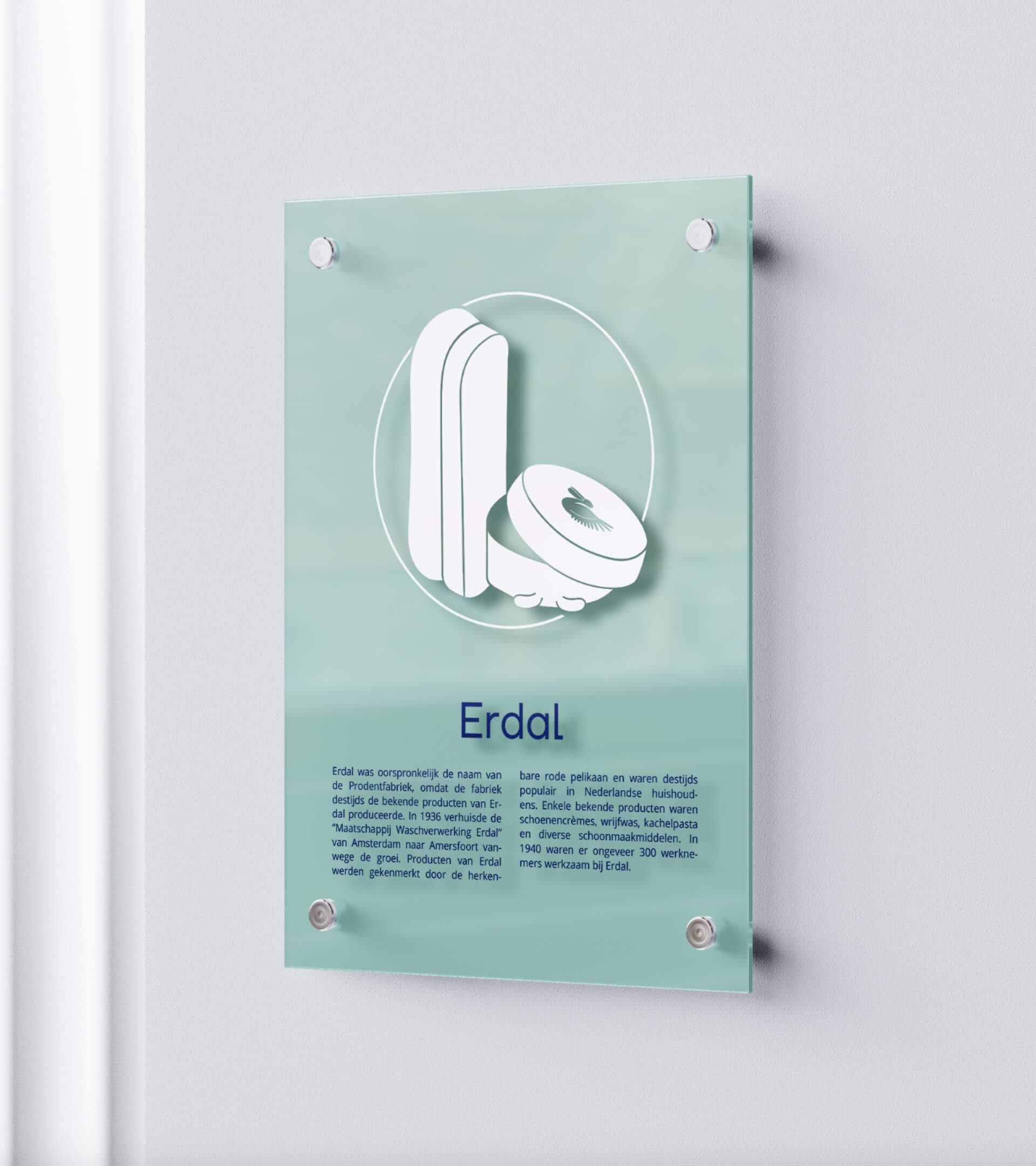
Inspired by museums, the new Prodentfabriek is industrial yet business-oriented. Each space has its own color to complement its ambiance.
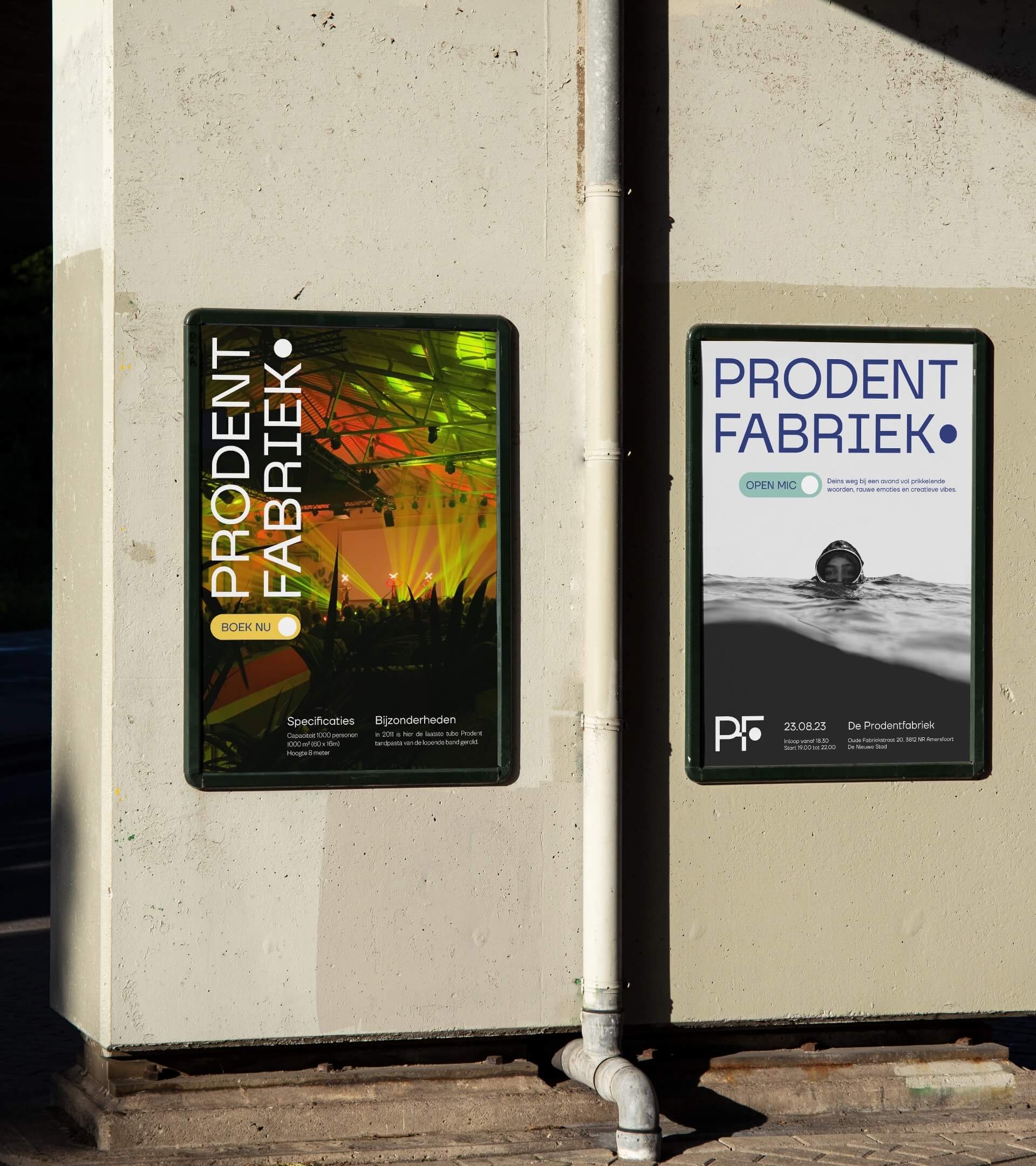
Signing
Each room has its own illustration inspired by the past. Signs displayed next to the main doors share the rich history of the venue.

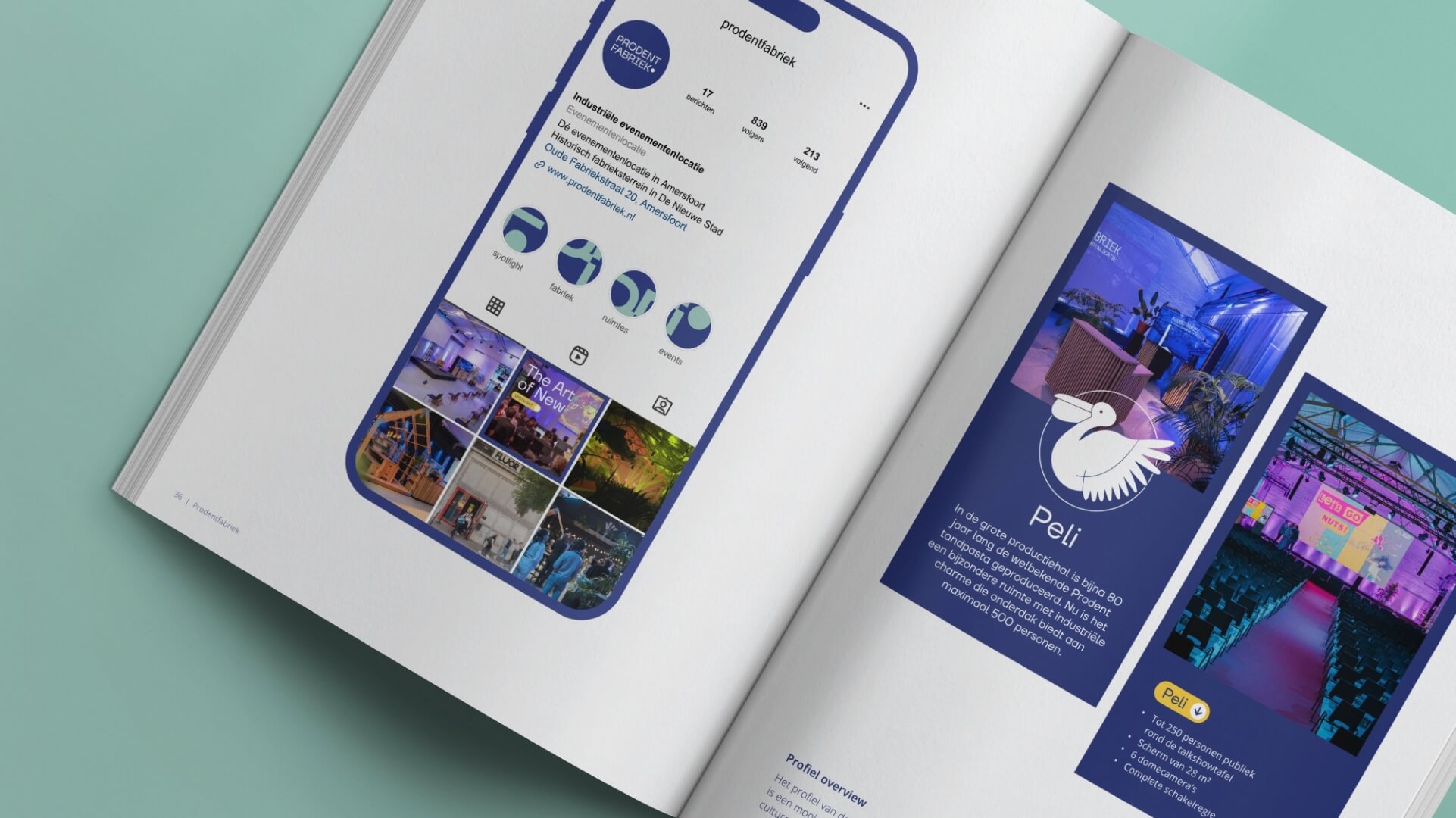
Visual language
The venue’s versatility is captured in its visual language—businesslike yet also creative and cultural, featuring characteristic elements and an industrial vibe.

Client talk
“They take the time to deeply explore the project from all angles.”
Our collaboration with La Même is very pleasant. They operate with a clear vision and plan, which is beneficial for us and our partners. Their choices and suggestions are both convincing and surprising.
Bülent Yokuş
Prodentfabriek
Credits
Fotografie · Merel Saarloos